Apr 20, 2010
Where’s the Heat???
Bill Dipuccio comments on a Roger Pielke Sr. Climate Science weblog
Recently we posted Roger Pielke Sr. exchange with Kevin Trenberth on UCAR’s press release on the “missing heat in the climate system” (forecast by the climate models) here. We agree with the following comments from Bill Dipuccio about the importance of the issue with links to the follow-up discussions on Climate Science weblog with Trenberth and Josh Willis of NOAA.
This press release from UCAR has major implications and I don’t think its getting as much attention as it deserves.
They admit that the alleged build-up of heat in the climate system cannot be documented by actual measurements and some of the energy may even be illusory. Of course they are confident that most of the energy is hidden somewhere, so they are calling for more thorough measurements, especially of ocean heat and TOA from satellites. See the graph below.

See enlarged image here.
Pielke has had extensive exchanges with Trenberth on this (updated again today) and a disagreement is opening up between Josh Willis and Trenberth regarding the quality of ocean data. Willis generally disagrees with Trenberth’s assertion that there is hidden heat in the deep layers.
See also Doug Hoffman’s summary here.
To paraphrase the old Wendy’s commercial, “Where’s the Heat!?”
Bill DiPuccio
Apr 19, 2010
Incredible Images of Iceland Volcano from Just a Few Kilometers Away
by Nancy Atkinson, Universe Today
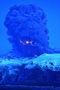
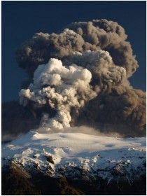
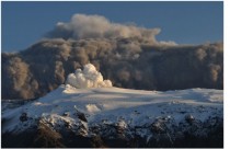
Astronomer Snaevarr Gudmundsson from Iceland was able to travel to within just a few kilometers from the Eyjafjallajokull volcano, and shared his incredible close-up images with Universe Today. “I stayed near the volcano from about 16:00 hours to 22:00 hours on Saturday and watched its impressive eruption,” Gudmundsson said in an email to me. “Amazing event, awesome explosions of 1200 C hot magma reaching ice and water. I shot more than 550 images during these hours of continuous enjoyment. Sounds ridiculous but its ever changing appearance was never boring.”

The massive plume put on an impressive display - from lightning forming within the plume to an incredible amount of spewing ash. On one of following pictures you can see helicopter for size comparison of the plume

The massive plume of Eyjafjallajokull volcano dwarfs a helicopter flying nearby (upper left). Image courtesy of and copyright Snaevarr Gudmundsson.
Gudmundsson said he and other photographers were a safe distance from the eruption, but were a few kilometers away. “Nearby was a small river and its prominent sound prevented us from hearing much in the eruption itself except a loud roar from thunders from time to time,” he said. “During daylight we even glimpsed some lightning but at dusk (the photo is taken at about 22:00 in the evening) they were easily spotted especially during active periods of explosions.”

The plume of Eyjafjallajokull volcano on April 17, 2010. Image courtesy of and copyright Snaevarr Gudmundsson.
I asked if there was any smell associated with the volcano and Gudmundsson said there was a bit of sulphuric smell in the air even though they were in a location where the wind was blowing towards the volcano. “The ash went to the other side of the volcano, as you can suggest, making life miserable for farmers and households below, but the rest of it climbed to higher altitude and from there to Europe.”
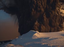
“From the foot of the volcano to the prominent top, seen in front of the tephra cloud (seen on some of the photos) the overall height is about 1300 -1400 m,” Gudmundsson said. “When the eruption began a huge flood went down beneath the obvious glacier to the left from the crater. And if you look closely on the photo showing the foot hills under the mountain a lot of icebergs can be seen on the flood plain. Under that same glacier was a rather deep lagoon (can’t been seen but sat between the two high moraines on either side of it, in front of the glacier) but sediment from the eruption filled it up in only two days at most! That is unbelievable. I have climbed this glacier many times but to approach it one usually must traverse the moraine, around the lagoon to reach the ice. But suddenly it is gone.”

Another view of Eyjafjallajokull volcano on April 17, 2010. Image courtesy of and copyright Snaevarr Gudmundsson.
Gudmundsson said the flood paths can be seen below the glacier as a narrow gorges carved into rather soft volcanic sediment.
Some of the latest reports from Iceland say that in some areas the volcanic fallout has been significant, clogging car engines, turning grass grey and reducing visibility to just a few meters.
The police say driving conditions can be very difficult in these places, but the area affected is remote with only a few hundred people, most of them living in isolated homes and many of them farmers. They have been advised to stay inside with the windows and doors shut and if they do venture out to wear goggles and a mask.
The staff of Landhelgisgaeslan (Icelandic Coastal Patrol) captured this radar image of the craters in Eyjafjallajokull on Friday. There are three main openings and each one is 200-500m in diameter.

Radar image of the volcano, taken by the Icelandic Coastal Patrol.
Our very special thanks to Snaevarr Gudmundsson for sharing his images and experiences of seeing the volcano “up close and personal.” Also thanks Col Maybury of radio station 2NUR in Newcastle, Australia for connecting me with Snaevarr (yes my connection to Iceland came through Australia!) and also thanks to erlinger on Twitter for help with Icelandic translations of news reports. See post here. More on this volcano this week. See earlier post from last spring on high latitude volcanoes in this prior story. Will be updated this week.
Apr 18, 2010
Quiet sun puts Europe on ice
By Stuart Clark, New Scientist
BRACE yourself for more winters like the last one, northern Europe. Freezing conditions could become more likely: winter temperatures may even plummet to depths last seen at the end of the 17th century, a time known as the Little Ice Age. That’s the message from a new study that identifies a compelling link between solar activity and winter temperatures in northern Europe.
The research finds that low solar activity promotes the formation of giant kinks in the jet stream. These kinks can block warm westerly winds from reaching Europe, while allowing in winds from Arctic Siberia. When this happens in winter, northern Europe freezes, even though other, comparable regions of the globe may be experiencing unusually mild conditions.
Mike Lockwood at the University of Reading in the UK began his investigation because these past two relatively cold British winters coincided with a lapse in the sun’s activity more profound than anything seen for a century. For most of 2008-9, sunspots virtually disappeared from the sun’s surface and the buffeting of Earth by the solar magnetic field dropped to record lows since measurements began, about 150 years ago.
Lockwood and his colleagues took average winter temperatures from the Central England Temperature dataset, which extends back to 1659, and compared it with records of highs and lows in solar activity. They found that during years of low solar activity, winters in the UK were far more likely to be colder than average. “There is less than a 1 per cent probability that the result was obtained by chance,” says Lockwood, in a paper to appear in Environmental Research Letters (DOI: 10.1088/1748-9326/5/2/024001).
Judith Lean, a solar-terrestrial physicist at the US Naval Research Laboratory in Washington DC, says the analysis is statistically robust, and reckons it forms a piece in the larger puzzle of how solar activity influences weather. Often cited by climate-change sceptics as a cause of global warming (see “What are you up to, sunshine?"), the effects of solar cycles have largely evaded the grasp of climate modellers. Lockwood found that when he removed 20th-century warming due to industrial emissions from his models, the statistical link between solar lows and extreme winters was stronger, suggesting the phenomenon is unrelated to global warming. But the sun undeniably has a big influence on weather systems: it is, after all, the energy source that powers them.
“All the little pieces are adding up into something much bigger,” says Lean. “People are beginning to realise that European weather is particularly susceptible to solar activity.” A study she published in 2008 found that warmer-than-average temperatures were more likely in northern Europe when solar activity is high (Geophysical Research Letters, DOI: 10.1029/2008GL034864).
Lean says research like hers and Lockwood’s is helping to overcome a long-standing reticence among climate scientists to tackle the influence of solar cycles on the climate and weather. A big clue to the nature of this influence may lie in work published in 2008 by David Barriopedro at the University of Lisbon, Portugal, and colleagues. They investigated so-called “blocking events” in the mid-latitude jet stream during the winters of 1955-99.
The jet stream brings winds from the west, over the Atlantic, and into northern Europe. Blocking occurs when the meanders in the jet stream become so large that they double back on themselves, halting the prevailing westerly winds and allowing cold north-easterlies to take control (see diagram). Barriopedro found that when solar activity is low, the blocking events move eastwards across the Atlantic towards Europe, effectively opening an atmospheric corridor to the frigid Siberian Arctic.
But how can solar variability influence the jet stream? One finger of suspicion is pointing at the stratosphere, the layer of the atmosphere that lies 20 to 50 kilometres above our heads. There, patterns of winds and temperature are known to be influenced by solar activity, says Lockwood. This is because peaks in ultraviolet radiation emitted by the sun boost ozone formation in the stratosphere, which in turn absorbs more ultraviolet and heats up. The heating is greatest in the region of the stratosphere nearest to the sun and so a temperature gradient appears across the stratosphere and winds are born.
How this affects the weather below is still debated. Very little is known about the physics that governs the stratosphere, but one pattern that is emerging is that stratospheric “weather” is linked to the troposphere below it - where our everyday weather and currents like the jet stream reside. Edwin Gerber of New York University studies these interactions. He and colleagues showed in 2009 that upward movements of air in the troposphere can change the patterns of stratospheric winds. These changes, in turn, can be reflected back down to the troposphere and influence weather at the surface of the Earth (Geophysical Research Letters, DOI: 10.1029/2009GL040913). “Changes in the stratospheric winds influence the path of winter storms across Europe,” Gerber says.
If researchers can prove that the sun can similarly induce changes in the troposphere via the stratosphere, which Gerber thinks they will, this could solve one of the biggest puzzles of the Little Ice Age - namely, that it appeared to have been a peculiarly European phenomenon, with other parts of the globe largely spared. The effects of the sun on the stratosphere are not global, says Lockwood. “They change the way the atmospheric energy is distributed around the world rather than change the total amount of energy being put into it.”
Future studies may show that the effects of changes in solar activity can be felt further afield, but for now it seems that Europe is particularly susceptible because it happens to sit under the northern jet stream at a longitude where its meanders can grow into kinks.
Although sunspot activity is gradually returning, astronomers are not expecting it to reach its previously high levels. So if Lockwood is correct, while the general temperature trend in the northern hemisphere will increase in line with global warming over the coming decades, northern Europe can look forward to some more harsh winters. It may be time to buy some decent gloves.
How much influence solar activity wields over our climate has vexed scientists for centuries. Take the British astronomer William Herschel: in the late 18th century, he compared the price of wheat in England with the number of sunspots and suggested that years with more sunspots produced good harvests, keeping the price lower.
Since the discovery of the 11-year solar cycle in the mid-19th century, many have sought to make links between different elements of solar variability and changes in climate. Here’s a snapshot of the arguments and the evidence.
Cosmic rays: One persistent claim is that cosmic rays could affect cloud formation, influencing climate - but most analyses have found little or no correlation. CERN in Switzerland is running an experiment that will provide data about how likely such particles are to cause cloud formation.
Sunspots: People have tried to link the number of sunspots during the 20th century with rising global temperatures. But average sunspot numbers have been dropping since the 1920s. Global mean temperatures, meanwhile, have risen over the same period.
Ultraviolet rays: Less easy to dismiss has been the idea that changes in ultraviolet radiation from the sun, a quantity closely linked to solar activity, could influence the climate. Direct measurements only began in 2003. However, average solar activity has fallen over the last two decades while temperatures have risen, making it unlikely that UV radiation is a dominant driver of global temperatures.
Irradiance: Measurements of the sun’s brightness - an indicator of its energy output - only began in 1977. Irradiance rose between 1977 and 1985, but has been dropping since.
Since about 1985, all the solar factors that could have warmed the climate have been going in the wrong direction, says Lockwood. “If they were really a big factor we would have cooling by now.”
Apr 18, 2010
Is There “Missing” Heat In The Climate System? My Comments On This NCAR Press Release
By Roger Pielke Sr., Climate Science Weblog
There was a remarkable press release 0n April 15 from the NCAR/UCAR Media Relations titled
“Missing" heat may affect future climate change
The article starts with the text
BOULDER - Current observational tools cannot account for roughly half of the heat that is believed to have built up on Earth in recent years, according to a “Perspectives” article in this week’s issue of Science. Scientists at the National Center for Atmospheric Research (NCAR) warn in the new study that satellite sensors, ocean floats, and other instruments are inadequate to track this “missing” heat, which may be building up in the deep oceans or elsewhere in the climate system.
“The heat will come back to haunt us sooner or later,” says NCAR scientist Kevin Trenberth, the lead author. “The reprieve we’ve had from warming temperatures in the last few years will not continue. It is critical to track the build-up of energy in our climate system so we can understand what is happening and predict our future climate.”
Excerpts from the press release reads
“‘Either the satellite observations are incorrect, says Trenberth, or, more likely, large amounts of heat are penetrating to regions that are not adequately measured, such as the deepest parts of the oceans. Compounding the problem, Earth’s surface temperatures have largely leveled off in recent years. Yet melting glaciers and Arctic sea ice, along with rising sea levels, indicate that heat is continuing to have profound effects on the planet.”
“A percentage of the missing heat could be illusory, the result of imprecise measurements by satellites and surface sensors or incorrect processing of data from those sensors, the authors say. Until 2003, the measured heat increase was consistent with computer model expectations. But a new set of ocean monitors since then has shown a steady decrease in the rate of oceanic heating, even as the satellite-measured imbalance between incoming and outgoing energy continues to grow.”
Some of the missing heat appears to be going into the observed melting of ice sheets in Greenland and Antarctica, as well as Arctic sea ice, the authors say.
Much of the missing heat may be in the ocean. Some heat increase can be detected between depths of 3,000 and 6,500 feet (about 1,000 to 2,000 meters), but more heat may be deeper still beyond the reach of ocean sensors.
Trenberth’s [and co-author, NCAR scientist John Fasullo], however, are grasping for an explanation other than the actual real world implication of the absence of this heat.
* First, if the heat was being sequestered deeper in the ocean (lower than about 700m), than we would have seen it transit through the upper ocean where the data coverage has been good since at least 2005. The other reservoirs where heat could be stored are closely monitored as well (e.g. continental ice) as well as being relatively small in comparison with the ocean.
*Second, the melting of glaciers and continental ice can be only a very small component of the heat change (e.g. see Table 1 in Levitus et al 2001 “Anthropogenic warming of Earths climate system”. Science).
Thus, a large amount heat (measured as Joules) does not appear to be stored anywhere; it just is not there.
There is no “heat in the pipeline” [or “unrealized heat"] as I have discussed most recently in my post
Continued Misconception Of The Concept of Heating In The Pipeline In The Paper Vermeer and Rahmstorf 2009 Titled “Global Sea Level Linked To Global Temperature”
Kevin Trenberth and John Fasullo are not recognizing that the diagnosis of upper ocean heat content changes (with it large mass) makes in an effective integrator of long term radiative imbalances of the climate system as I discussed in my papers
Pielke Sr., R.A., 2008: A broader view of the role of humans in the climate system. Physics Today, 61, Vol. 11, 54-55 (PDF) and
Pielke Sr., R.A., 2003: Heat storage within the Earth system. Bull. Amer. Meteor. Soc., 84, 331-335 (PDF).
The assessment of ocean heat storage changes in Joules is a much more robust methodology to assess global warming than the use of small changes in the satellite diagnosis of radiative forcing from the satellites which have uncertainties of at least the same order. Trenberth and Fasullo need to look more critically at the satellite data as well as propose how heat in Joules could be transported deep into the ocean without being seen.
UPDATE (April 16 2010) WITH RESPONSE BY KEVIN TRENBERTH PRESENTED WITH HIS PERMISSION
Dear Roger
I do not agree with your comments. We are well aware that there are well over a dozen estimates of ocean heat content and they are all different yet based on the same data. There are clearly problems in the analysis phase and I dont believe any are correct. There is a nice analysis of ocean heat content down to 2000 m by von Schuckmann, K., F. Gaillard, and P.-Y. Le Traon 2009: Global hydrographic variability patterns during 20032008, /J. Geophys. Res.,/ *114*, C09007, doi:10.1029/2008JC005237. but even those estimates are likely conservative. The deep ocean is not well monitored and nor is the Arctic below sea ice. That said, there is a paper in press (embargoed) that performs an error analysis of ocean heat content.
Our article highlights the discrepancies that should be resolved with better data and analysis, and improved observations must play a key role.
Kevin
MY REPLY
Hi Kevin
Thank you for your response. I am aware of the debate on the quality of the ocean data, and have blogged on the von Schuckman et al paper. Since 2005, however, the data from 700m to the surface seems robust spatially (except under the arctic sea ice as you note). An example of the coming to agreement among the studies is Figure 2 in Leuliette, E. W., and L. Miller (2009), Closing the sea level rise budget with altimetry, Argo, and GRACE, Geophys. Res. Lett., 36, L04608, doi:10.1029/2008GL036010.
We both agree on the need for further data and better analyses. I have posted on this issue; e.g. see here.
However, I do not see how such large amounts of heat could have transited to depths below 700m since 2005 without being detected. I am very supportive, however, of your recognition that it is heat in Joules that we should be monitoring as a primary metric to monitor global warming. Our research has shown significant biases in the use of the global average surface temperature for this purpose; e.g.
Pielke Sr., R.A., C. Davey, D. Niyogi, S. Fall, J. Steinweg-Woods, K. Hubbard, X. Lin, M. Cai, Y.-K. Lim, H. Li, J. Nielsen-Gammon, K. Gallo, R. Hale, R. Mahmood, S. Foster, R.T. McNider, and P. Blanken, 2007: Unresolved issues with the assessment of multi-decadal global land surface temperature trends. J. Geophys. Res., 112, D24S08, doi:10.1029/2006JD008229 (PDF)
Klotzbach, P.J., R.A. Pielke Sr., R.A. Pielke Jr., J.R. Christy, and R.T. McNider, 2009: An alternative explanation for differential temperature trends at the surface and in the lower troposphere. J. Geophys. Res., 114,
D21102, doi:10.1029/2009JD011841 (PDF)
Would you permit me to post your reply below along with my response on my weblog.
Best Regards
Roger
KEVIN’S FURTHER REPLY
Roger you may post my comments. The V.s paper shows quite a lot of heat below 700 m.
Kevin
MY FURTHER RESPONSE
Hi Kevin
Thanks! On the V.s et al paper, lets assume their values since 2005 deeper than 700m are correct [which I question since I agree with you on the data quality and coverage at the deeper depths]. However, if they are correct, how much of this heat explains the “missing” heat? It would be useful (actually quite so) if you would provide what is the missing heat in Joules.
Roger
END OF UPDATE
See full post here.
Apr 15, 2010
Stephen McIntyre: Oxburgh’s Trick to Hide the Trick
By Stephen McIntyre, Climate Audit
"The Oxburgh report “ is a flimsy and embarrassing 5-pages.
They did not interview me (nor, to my knowledge, any other CRU critics or targets). The committee was announced on March 22 and their “report” is dated April 12 - three weeks end to end - less time than even the Parliamentary Committee. They took no evidence. Their list of references is 11 CRU papers, five on tree rings, six on CRUTEM. Notably missing from the “sample” are their 1000-year reconstructions: Jones et al 1998, Mann and Jones 2003, Jones and Mann 2004, etc.)
They did not discuss specifically discuss or report on any of the incidents of arbitrary adjustment ("bodging"), cherry picking and deletion of adverse data, mentioned in my submissions to the Science and Technology Committee and the Muir Russell Committee. I’ll report on these issues later in the day as they’ll take a little time to review. First, let’s observe Oxburgh’s trick to hide the “trick”.
Long before Climategate, Climate Audit readers knew that you had to watch the pea under the thimble whenever youre dealing with the Team. This is true with Oxburgh of Globe International as well.
Oxburgh of Globe International alludes to the “trick..to hide the decline” in veiled terms as follows:
CRU publications repeatedly emphasize the discrepancy between instrumental and tree-based proxy reconstructions of temperature during the late 20th century, but presentations of this work by the IPCC and others have sometimes neglected to highlight this issue. While we find this regrettable, we could find no such fault with the peer-reviewed papers we examined.
Without specifically mentioning the famous “trick to hide the decline”, Oxburgh subsumes the “trick” as “regrettable” “neglect” by “IPCC and others”.
But watch the pea under Oxburgh’s thimble.
The Oxburgh Report regrettably neglected to highlight the fact that CRU scientists Briffa and Jones, together with Michael Mann, were the IPCC authors responsible for this “regrettable neglect” in the Third Assessment Report. They also regrettably neglected to report that CRU scientist Briffa was the IPCC author responsible for the corresponding section in AR4.
Oxburgh pretends that the fault lay with “IPCC and others”, but this pretence is itself a trick. CRU was up to its elbows in the relevant IPCC presentations that “regrettably” “neglected” to show the divergent data in their graphics.
It is also untrue that CRU authors, in their capacity as IPCC authors, “regrettably” “neglected” to show the divergent data in the IPCC graphics. The Climategate emails show that they did so intentionally - see for example IPCC and the Trick, which show awareness on the part of CRU scientists that showing the decline would “dilute the message” that IPCC wanted to send. The eventual IPCC figure, as reported here on a number of cases, gave a false rhetorical message of the veracity of the proxy reconstructions.
CA readers are also well aware that IPCC and Briffa were categorically asked by one AR4 reviewer (me) to disclose the divergent data. CRU’s Briffa refused, saying only that it would be “inappropriate” to show the data in the graphic. They didn’t “neglect” to show the divergent data from the Briffa reconstruction. This was a considered decision, carried out in AR4 despite pointed criticism.
Yes, the decline had been disclosed in the “peer reviewed literature”. Indeed, that was how I became aware of the trick - long before Climategate and why, as an AR4 peer reviewer, I asked that IPCC not use the trick once again in AR4.
IPCC presentations are how the climate science community speaks to the world. Climate scientists, including CRU scientists, have a far greater obligation of full, true and plain disclosure in IPCC reports than even the specialist literature. Oxburgh pretends that (partial) disclosure of adverse results by CRU in specialist literature is sufficient. It isnt. There was a continuing obligation to disclose adverse results in IPCC graphics.
CRU scientists acted as IPCC authors. The complaint about the trick arose out of how CRU scientists carried out their duties as IPCC authors.
In this respect, the Oxburgh report is a feeble sleight-of-hand that in effect tries to make the public think that the “trick” was no more than “regrettable” “neglect” by the “IPCC and others” - nothing to do with CRU. In other words, Oxburgh is using a trick to hide the “trick”.
Trick me once, shame on you.
Update 9.40 am. The Daily Telegraph reports:
Professor Hand did say that “inappropriate methods” were used by a separate university to draw up the infamous “hockey stick” graph showing the rise in global temperatures over more than 1,000 years.
Uh, memo to Oxburgh. CRU produced its own hockey stick graphs in Jones et al 1998, Mann and Jones 2003, for example. For some reason, Oxburgh and his associates regrettably neglected to consider these articles. See post here. See story in the UK Telegraph on Climategate scientists criticized in the report for not using the best statistical tools here.
See Myron Ebell’s summary of the CRU Climategate Whitewash for Pajamas Media here.
|


